Monday, May 20, 2013


Robert,
These are terrific character studies! Well done.

What I hope you take away from this assignment is the recognition there is more to drawing than moving the pencil around the paper. What separates the good from the great is the thinking behind the picture. All of the choices you make in the picture making process should be informed by your idea. All of these marks should serve that idea.

I hope these notes make sense. If you have any questions, feel free to contact me.

Good luck,

JTQ

New Sheldon Drawings

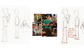
With these drawings, I really tried to add Sheldon's personality into the poses. The drawing with the picture next to it I wanted to draw because I felt it really shows how awkward he is. Also I just wanted to try a more dynamic expression.

Wednesday, May 15, 2013

notes on Sheldon


Character

I decided to use Sheldon Cooper from Big Bang Theory for this assignment. First, I did some research on his character and I chose a different genre for him:


I Then spent a very long time working out how I was going to draw him. After lots and lots of sketches, I finally settled on how I wanted him to look:


And here are some other pose sketches I did based on his character:


Monday, May 13, 2013

Final Panel Drawing

This idea was my favorite of the four sketches you did, so I went with it. I thought it would be cool to do this with the original pen drawing and a little color thrown in in photoshop.

O.k. Rob, I think the idea is solid, so now it's about the execution and the details and "pushing it" to really sell the idea. I put another sketch under yours to compare. I am just focusing on the snow woman and melted snow man for now.

I want my illustration to evoke some sort of emotion. Hopefully, in this case, it's to make people laugh, or at least smile.

This is probably one of many sketches I might do until I nail it. I am having fun as I am drawing, "feeling" the pose, as if I am an actor in the part of the snow woman. How would I feel? Does it come across in my drawing?

Whenever I approach an assignment, I'm always thinking about the what if questions and of the ways I can push the drawing to make it more funny and expressive. What details can I add to make the scene more funny, since this is a humorous card? How can I push her pose and expression, for example? Is she hunched over? Is her hand on her cheek, in sort of an "oh dear" or flabbergasted expression? What details in her face can I exaggerate? Is her nose tiny in contrast to her big eyes and big 1950's style hairdo? Is it funnier if the umbrella is tiny but the handle is long? Does she have rubber hose arms rather than sticks?

I want her body language to help tell the story that she is in shock, so she is hunched over. I want her nose, eyes, even body pointing down so that I direct the viewers eye toward the melted snowman. It's like telling a joke visually. The viewer looks at the snow woman first, then down at what she is looking at.

What funny little details can I do with the melted snowman?

I thought it would be funny to have the hat resting on top of the nose, with the eyes barely poking out. We see his boots in front of the puddle. Even the shape of the boots are wonky.

When working on or in trying to learn how to do humor illustration (or any genre of illustration) look at the great artists who are at the top. Analyze what makes their art successful. 

I try to make myself laugh, and the people at my art review laugh. If that happens, then I know I've succeeded to some degree.  I have a much better chance of convincing a customer in Target or Walmart to pick my card over all of the other ones on the rack!

Anyway, lots of food for thought... stuff I want you to think about as you approach every assignment. How can you push it to make it the best?

Friday, May 10, 2013

Feedback for melted snow man assignment

Rough sketches, based on feedback and thoughts below. What do you think about either #3 (showing morgue) or #4 at the "crime scene?"  Let me know what you think.

Panel Card Assignment

I tried to experiment with the POV and lighting with this.


Thursday, May 9, 2013

Panel Card assignment

Robert,

Until we hear from John, your next assignment will be to create a panel card (see attached for examples.) I will provide the copy, or writing to work with, along with some very simple direction (how the sentences break, simple planning/lettering styles for the design, even a color palette) below, but you can use the planning as a stepping off point in terms of layout, color, lettering and illustration style. We usually do 4-5 sketches and submit to the art director for review, then go ahead with a final illustration. Take a look at these.

The overall card size will be 9.5 x 7.25. so the Panel can be whatever size works withing that space.

This is an assignment that I am actually working on now. We work on Christmas is June, believe it or not, because it needs to be done well in advanced for printing/getting it to the retailers. I will show you my illustration when I am finished. This is Here is the copy:

(Within panel illustration, in a word baloon) "I can't really be sure it's him. I mean, it looks like his carrot..."

(The copy to go under the panel is this:) "C.S.I. North Pole: Special Victim's Unit"
(You don't need to use the quotation marks.)


It's a humorous version of a snow woman identifying her snow husband, who probably perished due to melting. :o)  All that's left is maybe his carrot and some coal in the morgue drawer. It's obviously a spin on the whole CSI TV shows combined with Christmas. Provided is a very quick sketch with color palette. Not necessary to follow. Come up with your own POV. Use whatever colors needed, but it's nice to start with a simple color palette first. We try to use red and greens, traditional colors, where we can. Maybe the border is one of those colors, or they are sprinkled in throughout the illustration where it makes sense. You can do outline and color fill. Sometimes I like to do illustrations that look like paintings, so I will not use an outline. If you would like to see examples let me know. I will leave the approach up to you.

SO....

Start with reference gathering, and rough sketches for composition. Maybe spend today on that and show me sketches and a reference board tomorrow.

Food for thought:
Who are the characters? Is the snow woman the wife of the melted "victim?" Is it the mother? A girlfriend? Is there a police man or a detective? An examiner? Are they all snowmen/Women? Or are they a mix of Snow woman, elf, reindeer, or Santa?  In terms of your characters "attitude" and "personality," how are they each reacting or "acting?" What is their body language? Expression? In terms of the setting,  is the morgue a typical human morgue, or is there something about the morgue that is unique to a snowman's world?

Good luck, have fun, and call/email/post on blog with any questions!

Tuesday, May 7, 2013

Pushing the sketch


Here is a quick sketch I did, based on your sketch. It's a scan of a rough pencil drawing (top). I changed the camera point of view so that we were not looking at the foreshortened character . I chose this composition above so that I am showing the audience exactly what I want them to see: A guy intimidated by the germs on his diner table items (plate glass, fork knife, ketchup), with another person behind him reacting to the scene.  I moved my camera up and more 3/4 so that you could clearly see everything that is going on. I manipulated the original sketch a bit in photoshop to pushed the attitude of the main character in the Hazmat suit. For example, when I say push the attitude of the character, this is what I mean: By having him in 3/4, leaning away from the germs in sketch 2, he feels more "freaked out." The germs are leaning toward the guy in the Hazmat suit so they appear more intimidating. There is a person sitting behind the main Character with the attitude of "what's the matter with THAT guy??"  I added a bit of tone to indicate light source. The idea is to focus the viewer's eye on the main character's face and eyes, and on the table top with all of the germs with lighting. This is just one approach of many. You can change the camera POV, the setting, even the attitude of these characters can be pushed even further. Are the germs tiny and intimidating or are they larger? As far as style, you can treat more cartoony or more realistic.

Have fun with this. I look forward to seeing your final result!

Saturday, May 4, 2013

Conceptual Illustration

Another great reference for illustration is theispot http://www.theispot.com Go to portfolios and search under category, subject, style and medium. In this case, click on the category editorial and humorous. You can see examples of "conceptual" and "humorous" under the "style" category.  This will give you more of an idea of the differences between the two. They also have a category on "Character Development" and "Medical Illustration." It's fun to poke around  to see various styles from different illustrtators for inspiration. I found this great example of an conceptual illustration that relates to our own assignment. I found this illustration by Shaw Nielson under the "medical" category. Very simple and graphic, but tells a story effectively without a single word. This could be about germs in the corporate world? But hopefully you get the idea.

Sample "thumbnail sketches"

Example of thumbnail sketches by Eric Carle. At this stage, he is trying to get the idea across. At the next stage, he would probably focus more on composition and design.

Friday, May 3, 2013

Develop your visual story: character, setting

Hi Robert!

A few quick thoughts...

After you fully brainstorm ideas in written form via your "word tree" and have gathered inspirational reference, you can start rough sketching your visual story (illustration) for the flu editorial assignment. This is the stage where you will explore what you are trying to "say" with your illustration. Your goal is to grab the attention of the reader of this newspaper, in this case, the April edition of the "The Funny Times." You want to get them to read the story with your engaging illustration. I will post some info about editorial illustration.

Start by designing your "story." The size of the illustration is in proportion to 4x3, so your final illustration could be 8x6. 

Spend today developing your character with several versions. Just do rough exploratory sketches in pencil, nothing finished. To keep it simple, you may want to limit yourself to black and white, even for the final illustration.

Some questions to ask yourself: Who/what is your character or characters? What story are you telling visually? (See some examples that I wrote on your blog) What details can you add to the character and setting to enhance your story telling in a visual way? What is it's size, personality, what is the character doing to tell your story or point of view visually?

Any questions? Ask away! You can respond under comments here, just to keep everything in one place, or you can email/call.